Context & Objective
Greenely helps users monitor and reduce electricity usage via visual tools. While Greenely already shows solar panel output and household consumption well, battery behavior (which includes both charging and discharging) presented a new challenge.
The goal of this project was to design a history graph that clearly communicates how the battery behaved over time—i.e. when it charged, when it discharged, where energy came from, and where it went—in a way that feels intuitive and visually clean.
My Role
As the Product Designer intern, I was responsible for:
- Sketching initial graph concepts and exploring different visual metaphors for bi-directional data.
- Iterating with over 50 design versions to refine clarity, color, and information hierarchy.
- Testing prototypes internally with cross-functional teams who had varying levels of battery knowledge.
- Deciding the final visual language (color, typography, labels) in collaboration with product stakeholders.
Design Process & Challenges
Ideation
Created initial drafts showing positive and negative stacks to represent charging vs discharging over a 24-hour period. Explored icons, titles and visual cues.
Visual Distinction
Focused on making it clear which state (charging/discharging) the user is viewing, and making data flows (sources/destinations of energy) obvious.
Information Density vs Clarity
One key challenge was fitting enough relevant information into the graph module without overwhelming users.
Key Design Decisions & Final Version
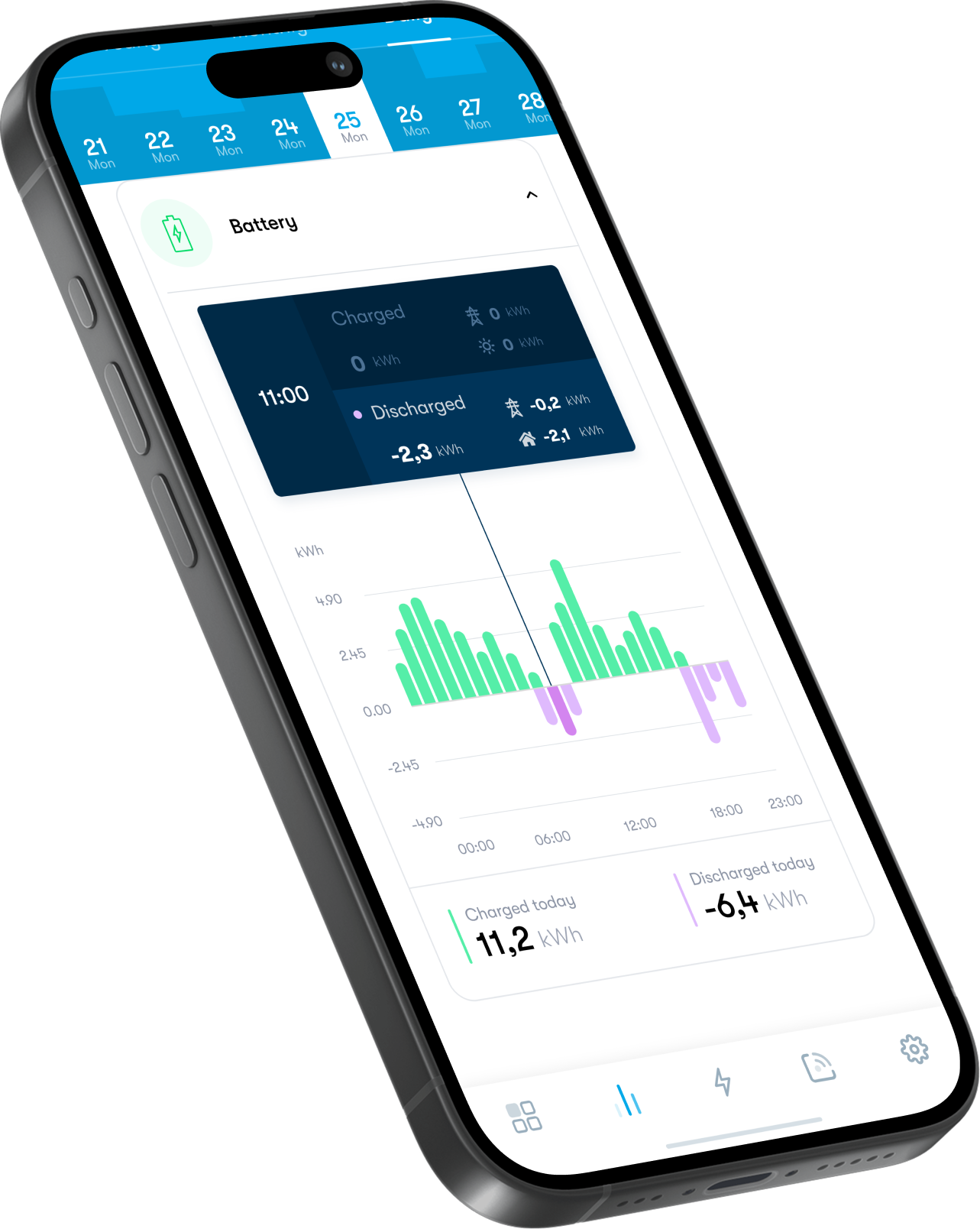
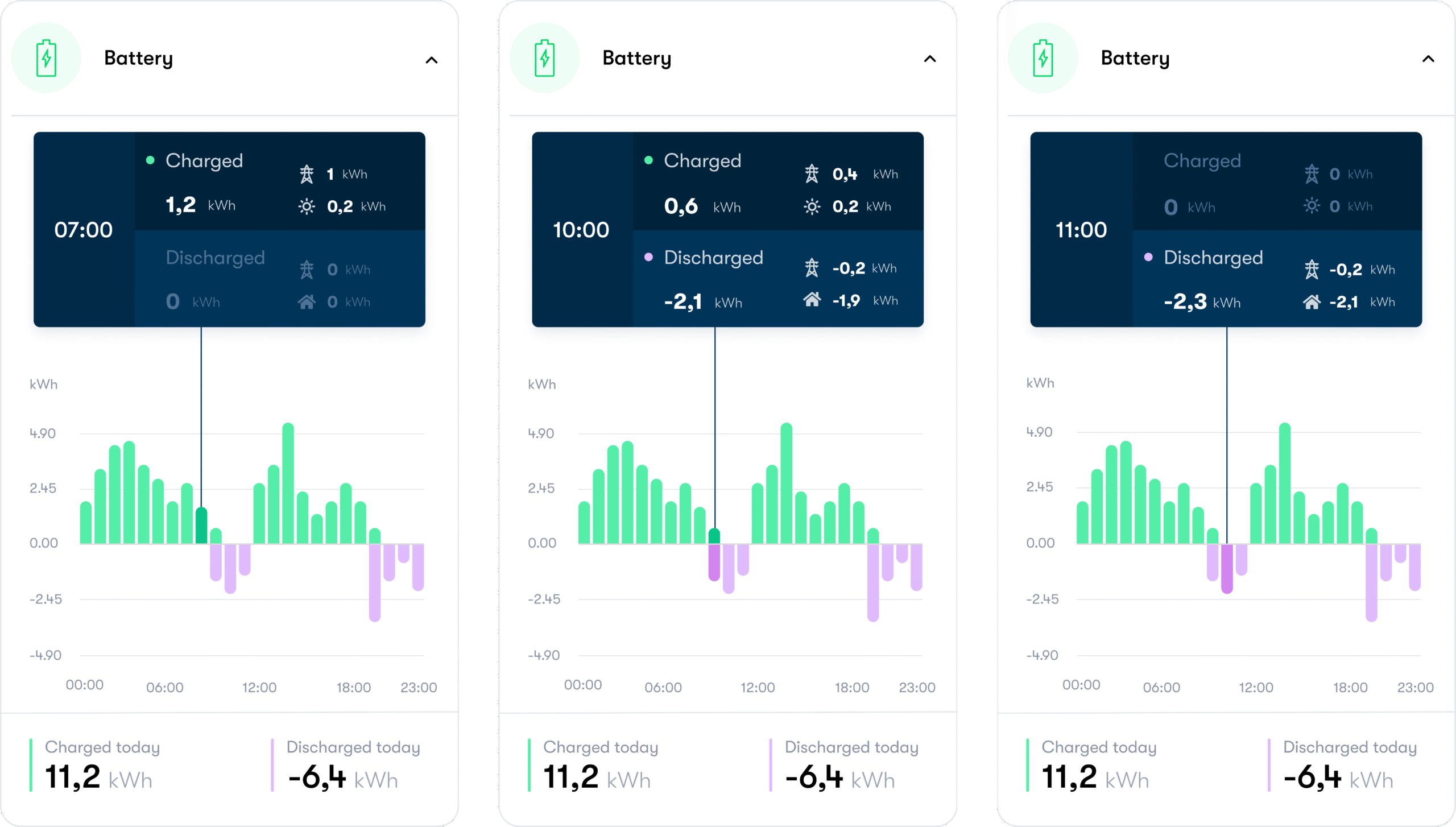
After ~50 iterations, the final version includes:

1.
Removed charging/discharging icons; replaced with textual labels “Charging” / “Discharging” plus a small indicator light for the currently selected state.

2.
Enhanced visual cues for selected state: stack color slightly darker, making active data stand out.

3.
Clear depiction of where energy is coming from and going to (inflow vs outflow).
4.
Internal usability testing among non-expert users (team members with limited battery knowledge) confirmed the graph was quickly understood and fairly intuitive.
Outcome & Impact
1
Clarity & Efficency
After 50+ iterations, the final history graph was both visually clear and functionally effective.
2
Intuitive Behaviour
Internal usability feedback indicated that non-experts could quickly understand battery behavior with minimal instruction.
3
Intuitive Behaviour
Internal usability feedback indicated that non-experts could quickly understand battery behavior with minimal instruction.
4
Production
The revised graph design was accepted into Greenely’s app, improving user comprehension of battery data over time.
Reflection
This project reinforced the importance of:
- Extensive iterating—small tweaks in visual presentation can significantly improve understanding.
- Balancing visual clarity and data accuracy, especially for complex bi-directional information.
- Validating design with real users, even within cross-functional team settings, to ensure concepts translate beyond the designer’s perspective.Synthesizing findings through affinity mapping